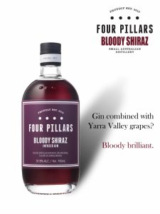
This was one of the first design projects I worked on, creating a magazine ad for Four Pillars’ Bloody Shiraz Gin. The goal was to produce a clean, bold hero ad that aligned with the brand’s identity and highlighted the unique qualities of the product.
I began by researching the Four Pillars brand to understand its tone, audience, and premium aesthetic. I focused especially on the Bloody Shiraz Gin’s distinct name and color. Inspired by the “bloody” in the name, I incorporated deep, dramatic tones into the design to reflect intensity and richness.
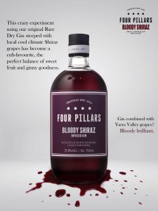
The layout was intentionally minimal—a hero shot of the bottle against a plain background—to draw all attention to the product itself. I kept the typography clean and strong, featuring the tagline:
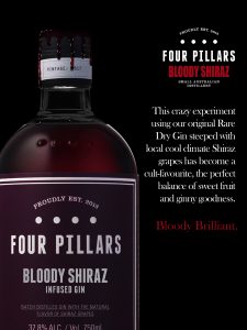
As one of my first professional projects, this was a fun and valuable learning experience. I became more confident using Photoshop, exploring tools and visual techniques to elevate the design. I also learned how simplicity, strong composition, and brand-focused details can come together to create an effective, visually striking advertisement.